Frutyka Juice
Brand & Packaging Design
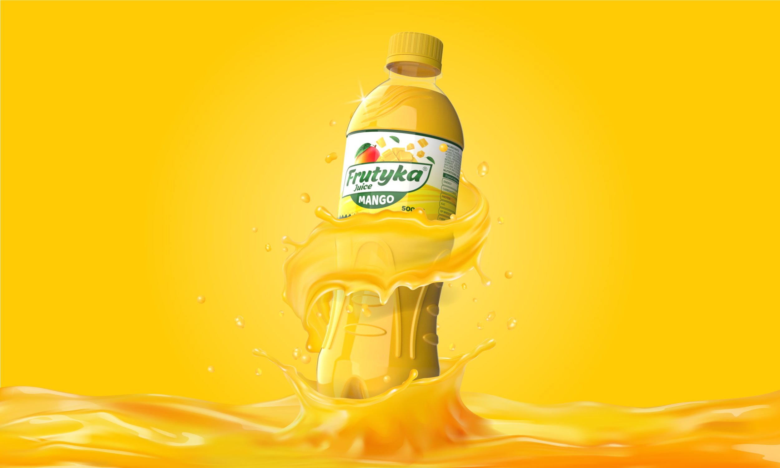
Brand & Packaging design for Frutyka Juice, Kenya, Africa
Client: Kabarnet Water, Kenya
Be Natural, Be Fresh
The story of Frutyka started with a dream to disrupt the African fruit juice market. This dream was the brainchild of Kishan, Sharad’s late brother. With Kishan’s blessings, Sharad brought Frutyka to life with a successful launch in Kenya, Africa. The ‘k’ in the brand name is an homage to the dreamer.
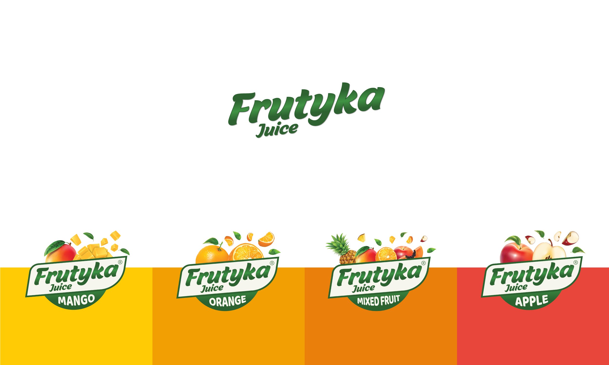
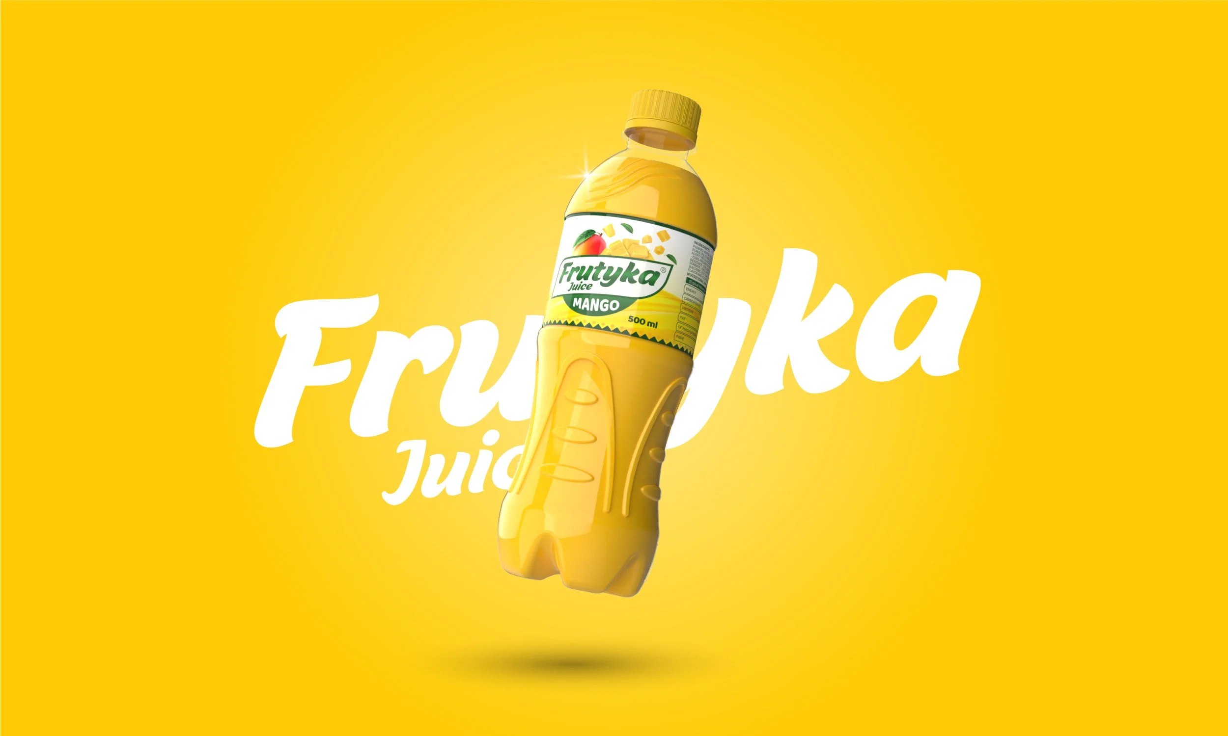
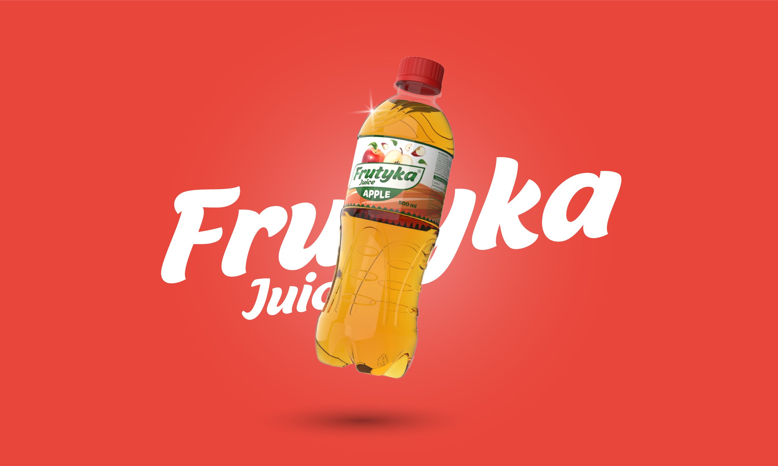
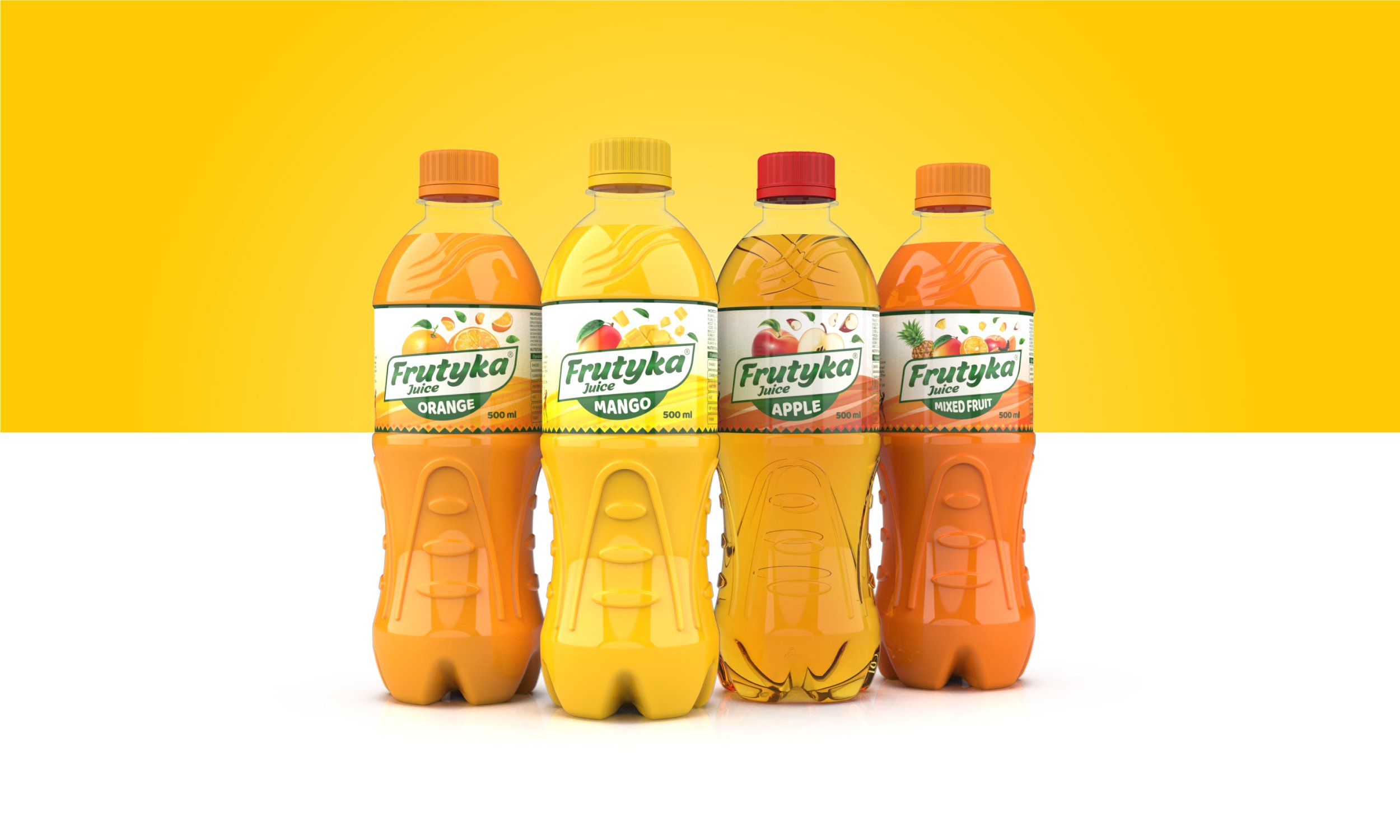
The unique Brand Identity design represents purity and nature through its typography and colours. With their ambition to disrupt and launch into the crowded supermarket shelves, they needed to be more than just another fruit juice brand. Frutyka’s unique packaging stands out on the shelves with its bright colours, vivid fruit visuals, and the design language extending to the bottle design. The colour palette is derived from fruit juices to bring consistency to the entire range of flavours. The current range includes Mango, Orange, Apple & Mixed Fruit with an opportunity to expand further in the future.
Shortly after launch, Frutyka went viral in the African market and already getting close to its top competitor.